Flexible Brand Identity
Mother Ocean is a festival project designed to celebrate surf culture while promoting ocean conservation through a flexible visual identity. The festival brings together a surf competition, live music performances, and educational programming that highlights conservation techniques and sustainability. The identity reflects the fluid, rhythmic nature of the ocean while remaining adaptable across posters, merchandise, digital platforms, and event signage. By balancing the energy of surfing and concerts with the mission of environmental stewardship, Mother Ocean creates a vibrant, memorable experience rooted in community, culture, and care for the sea.
Client
Mother Ocean
Year
2023
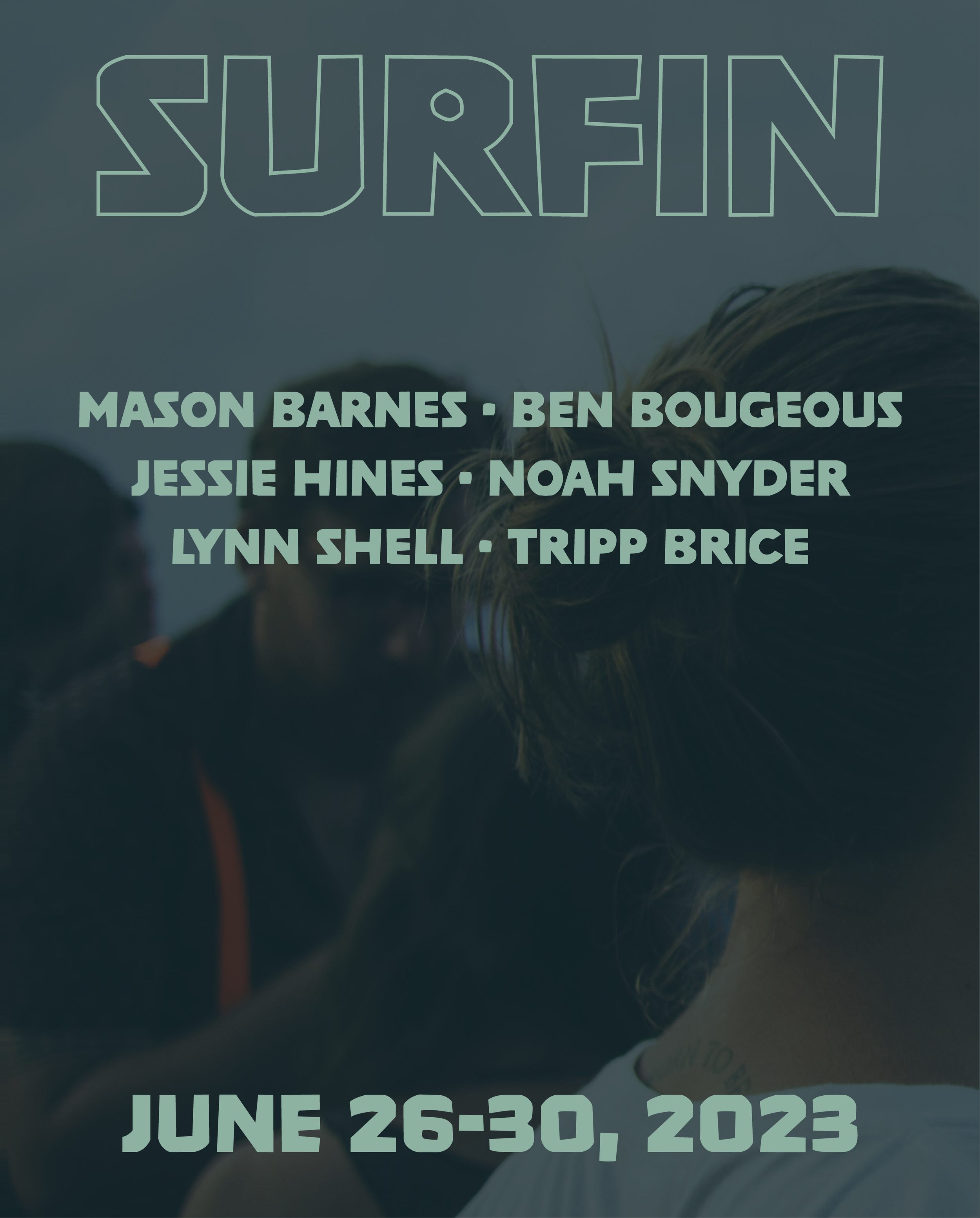
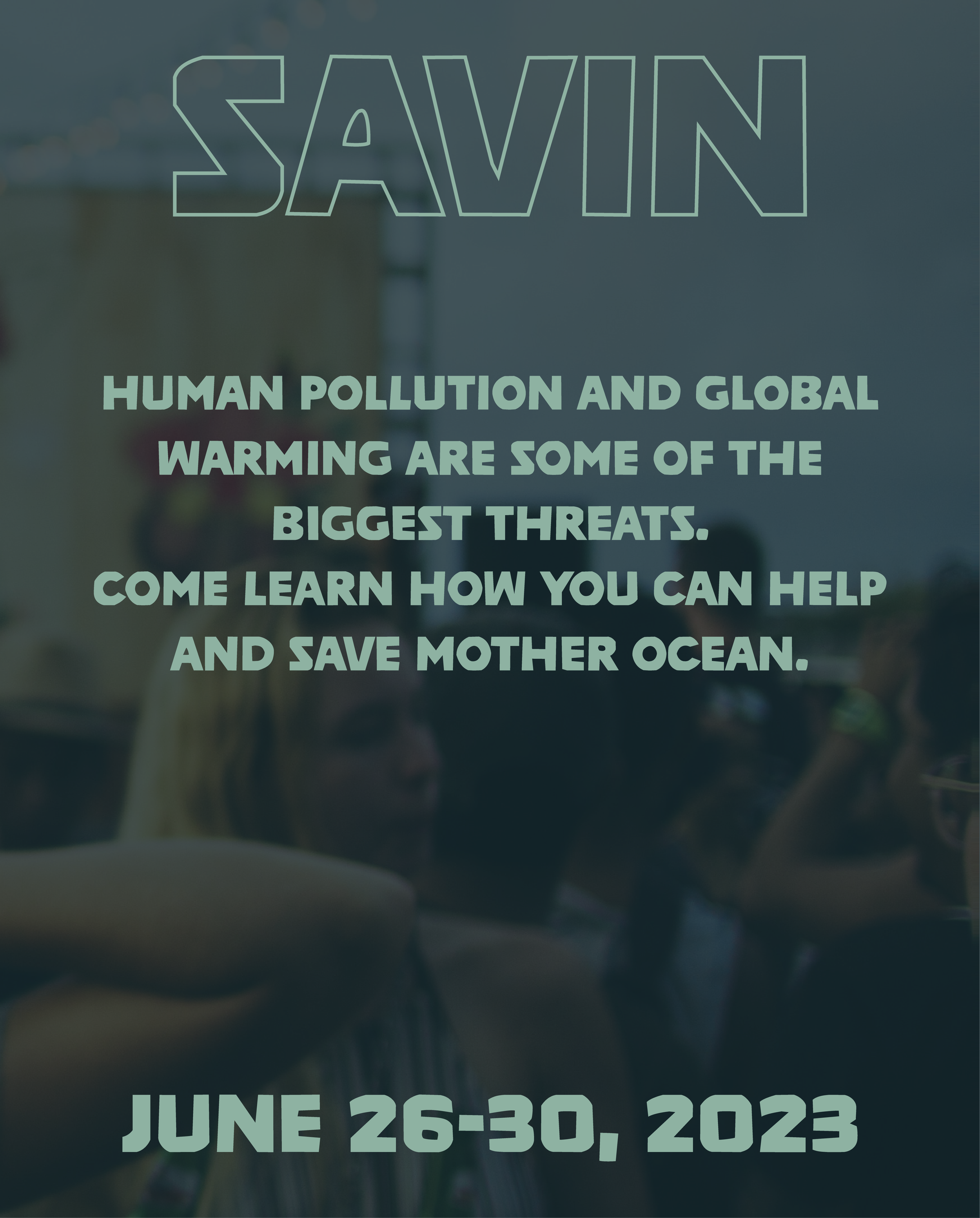
Posters
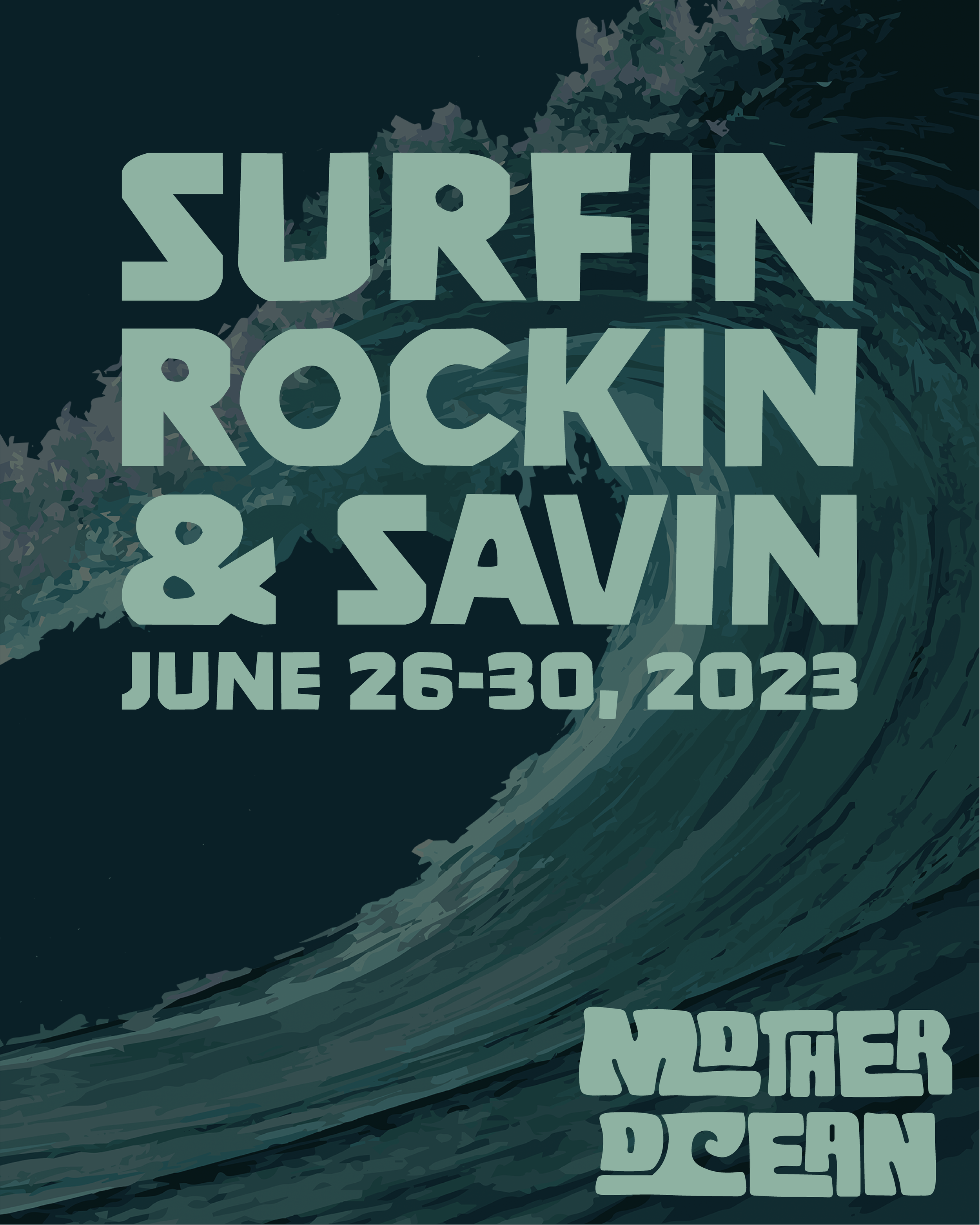
Series of posters in multiple color schemes to catch the eyes of viewer, providing them with a visual for the festival.
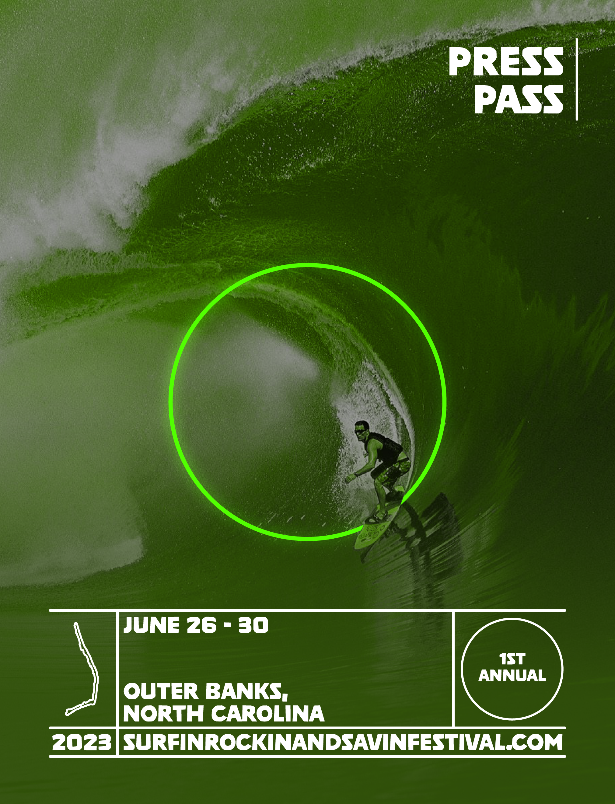
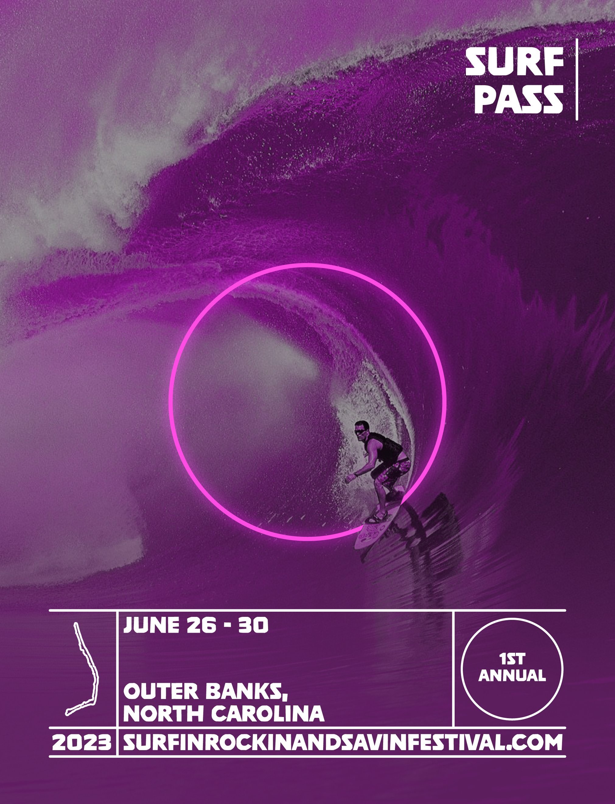
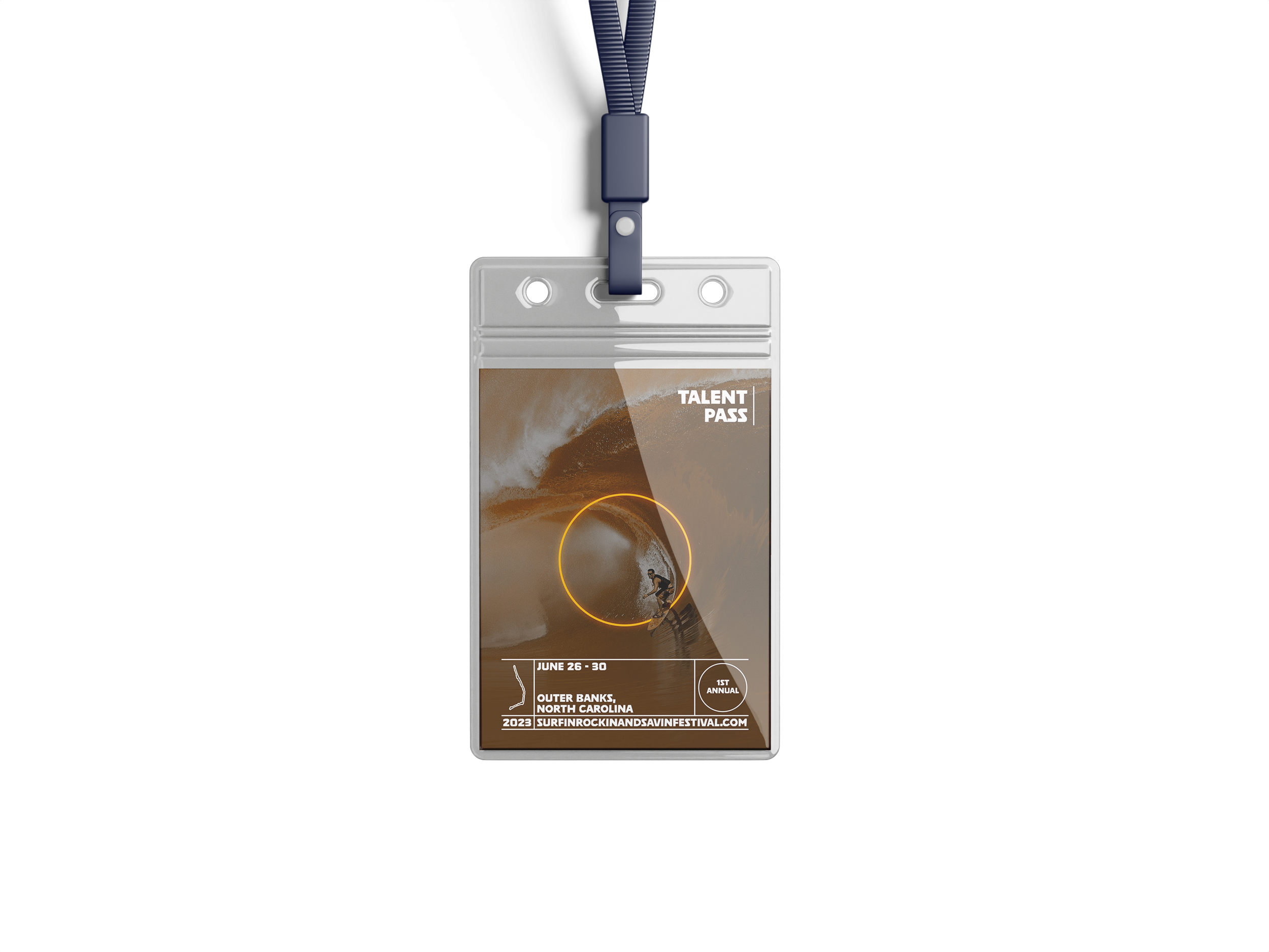
Access Passes
Passes for different people associated with the festival — staff members, surfers, press and media, and talent (musicians).
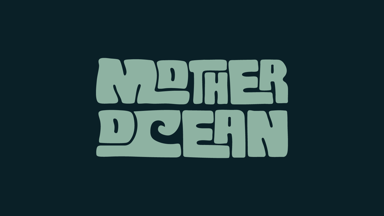
Logo
The Mother Ocean logo fells clam and organic, with soft, wave-like letterforms and a retro, nature-inspired vibe that reflects surf culture and flow.
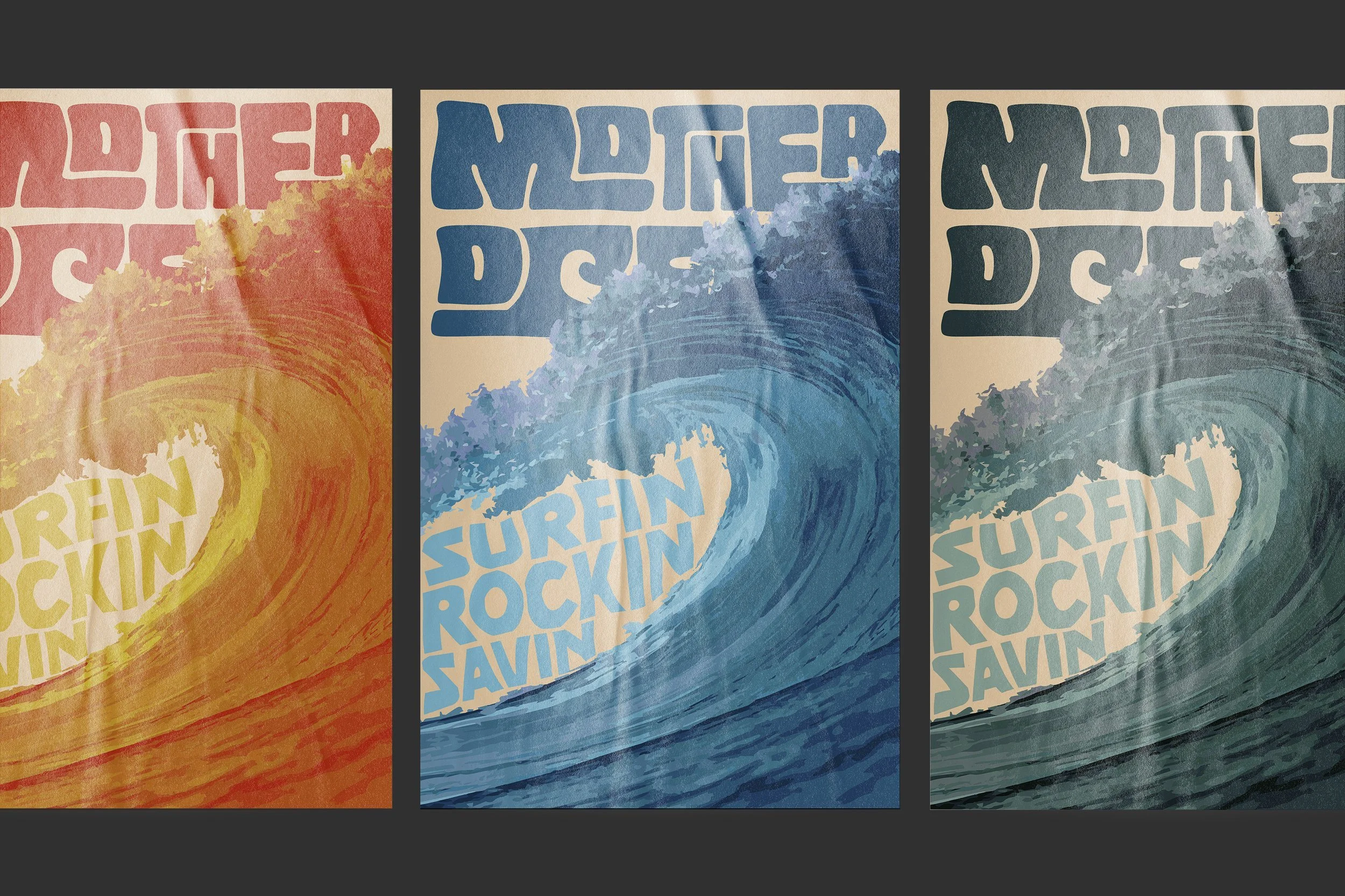
Social Media
Instagram post that gives viewers information about the festival, it’s principles of Surfin’, Rockin’, and Savin’.
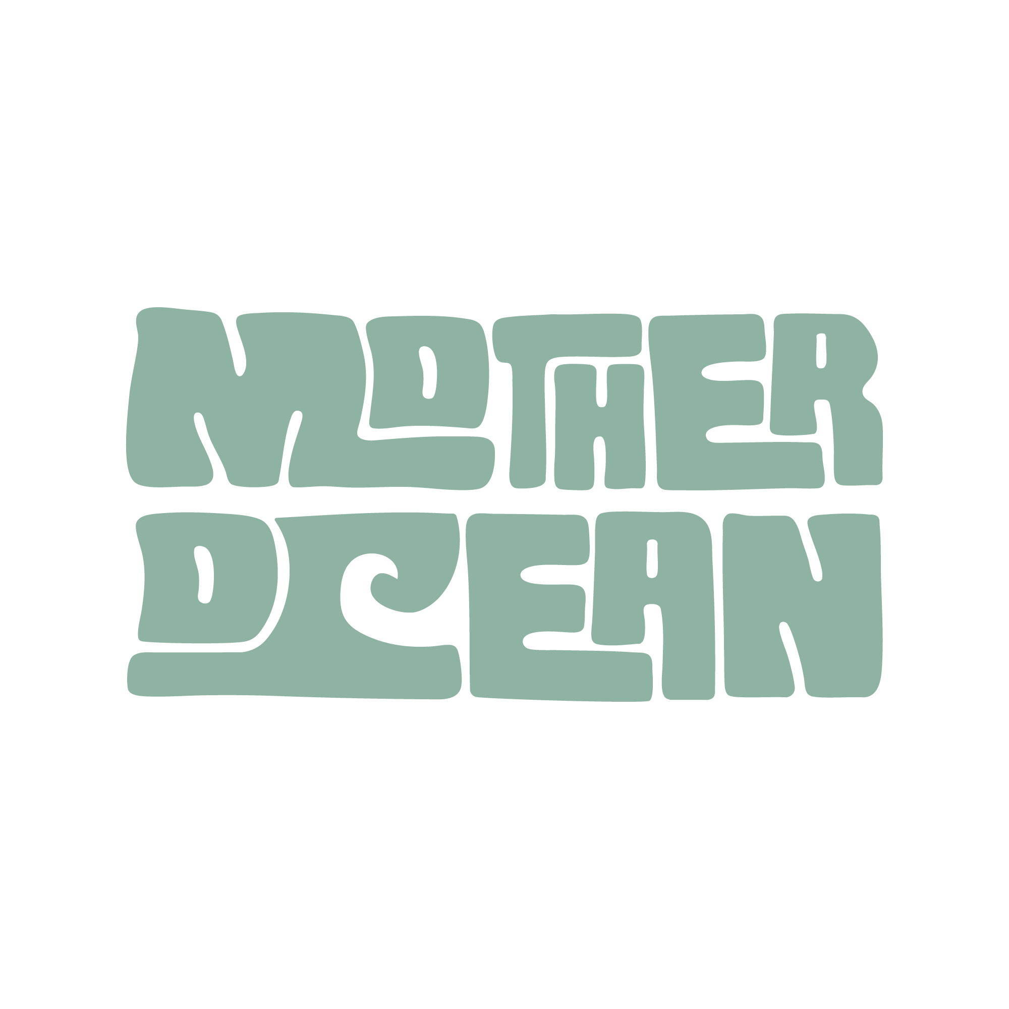
A custom, experimental, typographic logo, designed to resemble beach aesthetic, surf culture, and Polynesian symbolism, lending to the overall feeling of ease and conservation.

The Polynesian symbol “Vai” represents water, reinforcing the festival’s connection to surfing, ocean culture, and its deeper cultural roots.

Bold, energetic, and environmental tone with strong surf culture and retro-modern feel.