Brand Identity
The Salem Witches Brand Guidelines project established a cohesive visual identity inspired by the history, mystery, and folklore of Salem. The guidelines define the use of typography, color palette, logo applications, and graphic elements to create a brand that feels both eerie and refined. Balancing dark, atmospheric tones with striking accents, the system ensures consistency across print, digital, and merchandise applications. This project highlights how thoughtful design can capture the spirit of a story-rich theme while maintaining flexibility and professionalism in brand execution.
Client
WNBA
Year
2023–24
Brand Guidelines Manual
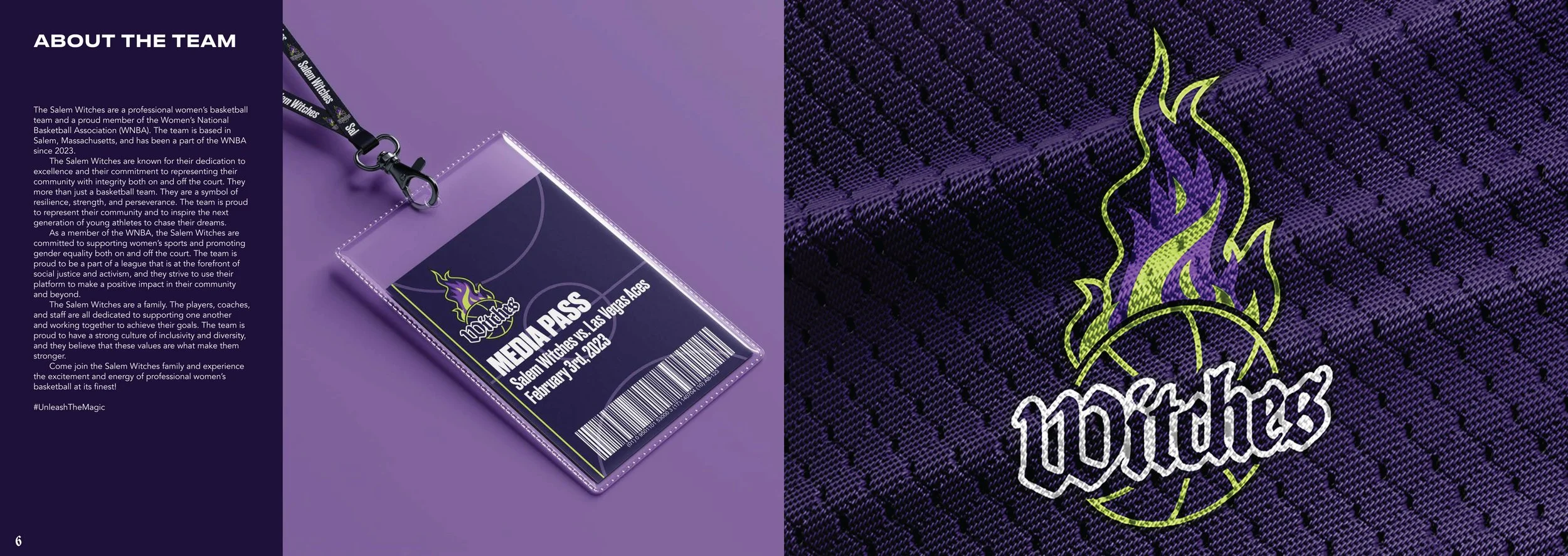
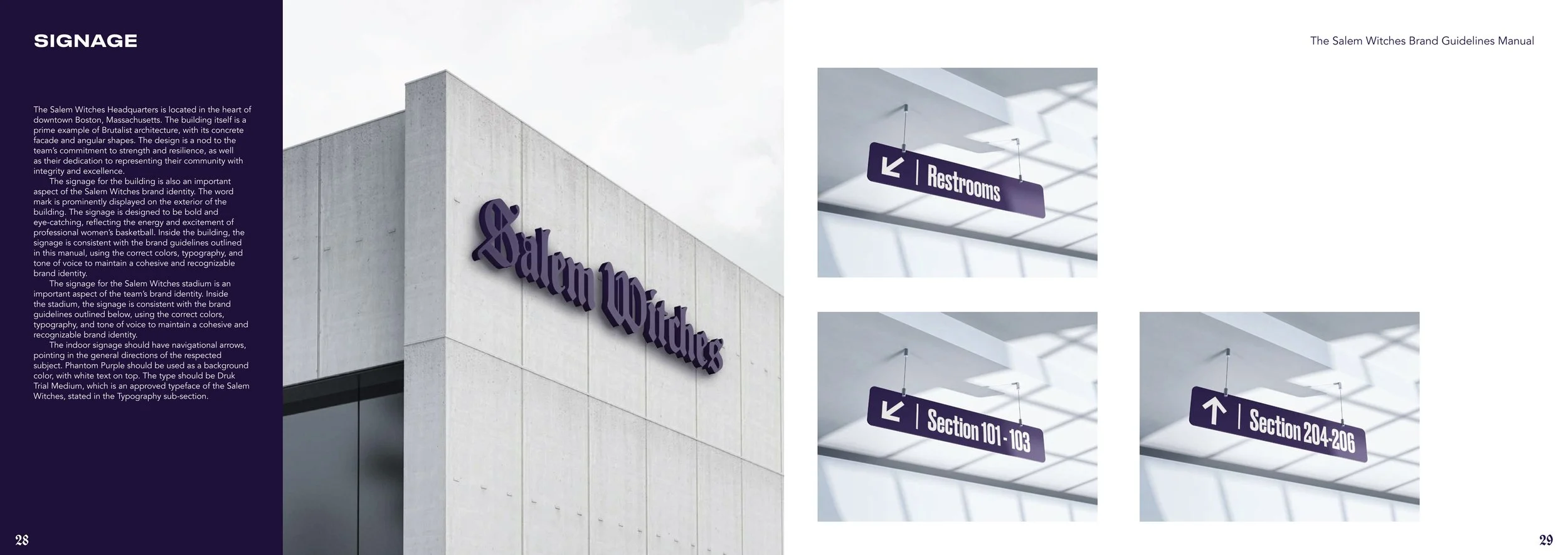
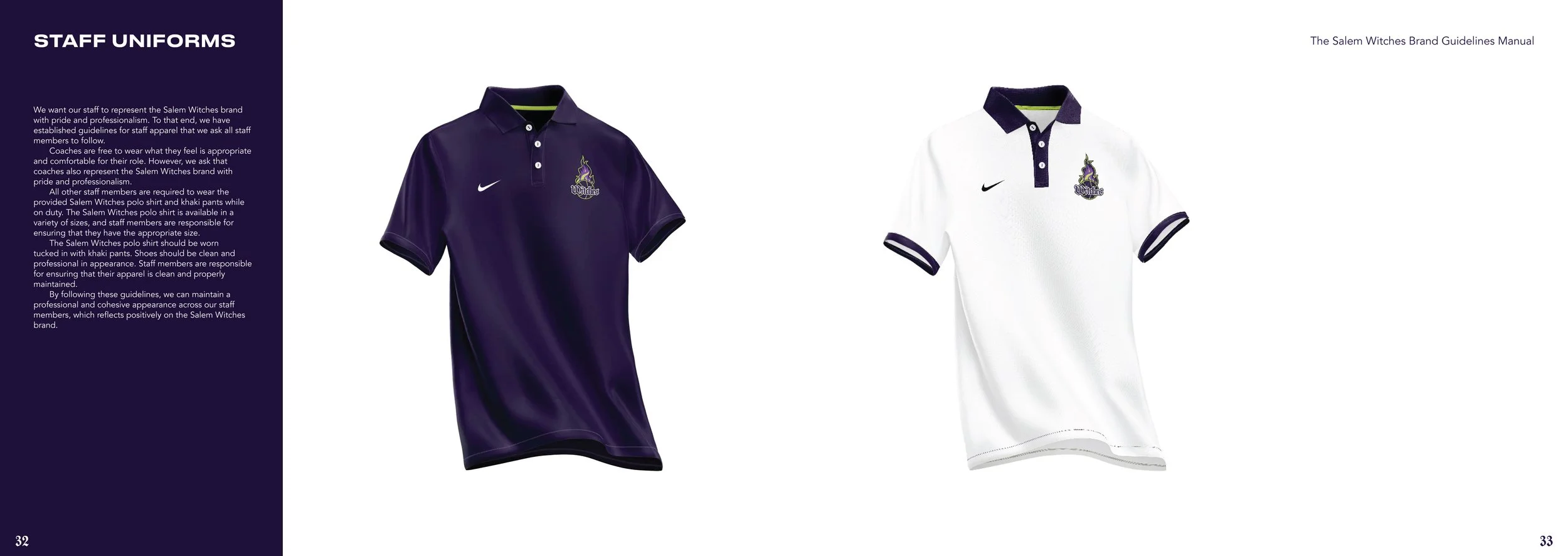
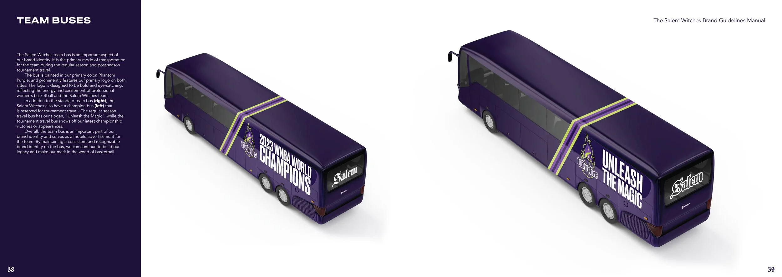
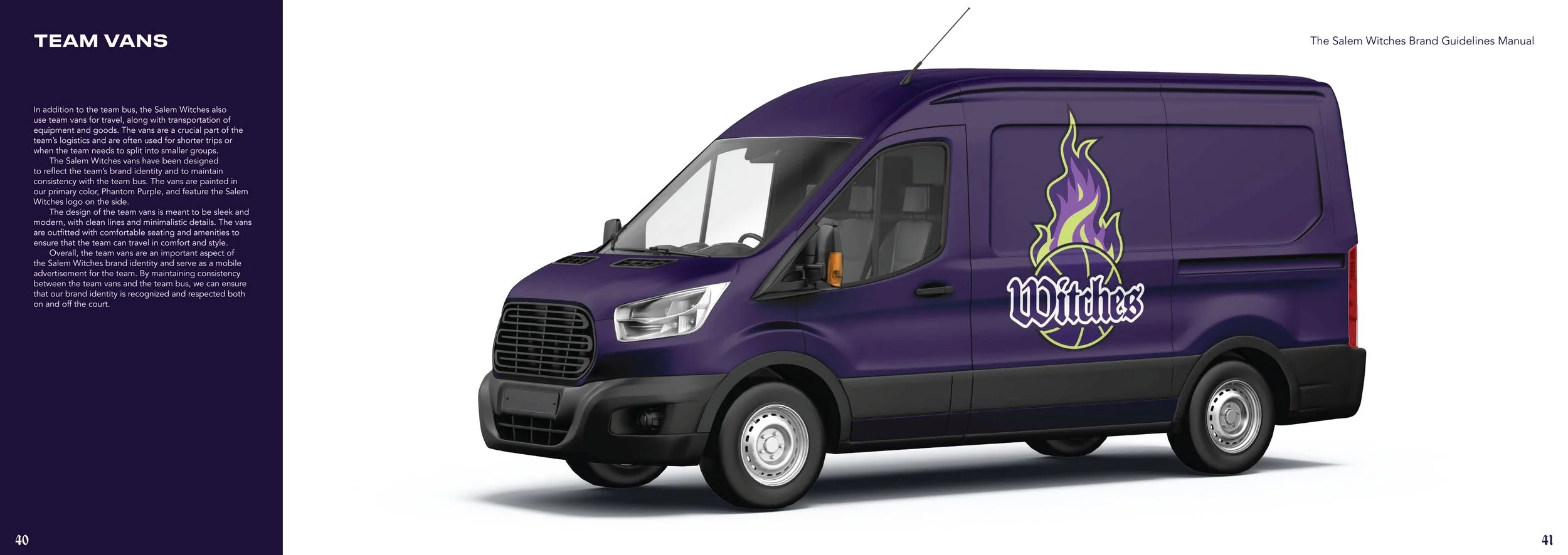
The Salem Witches Brand Guidelines Manual was created to help everyone who represents our team — including players, coaches, staff, and partners — understand and apply our brand consistently and effectively.
Logo
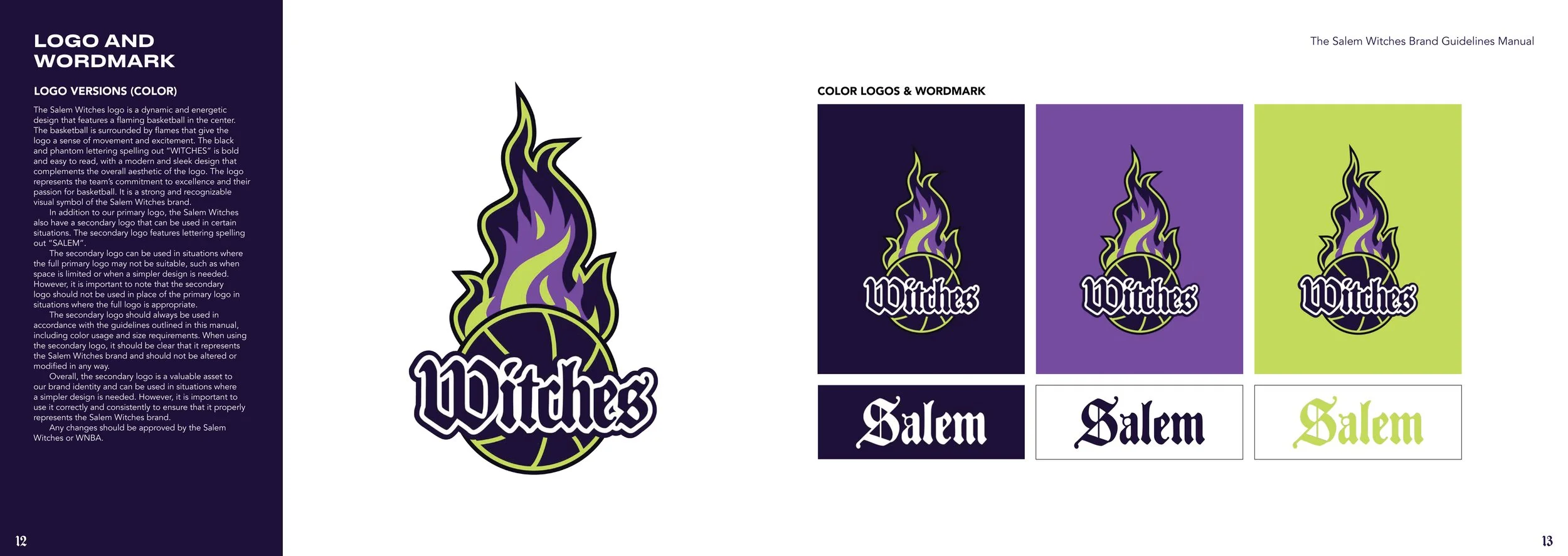
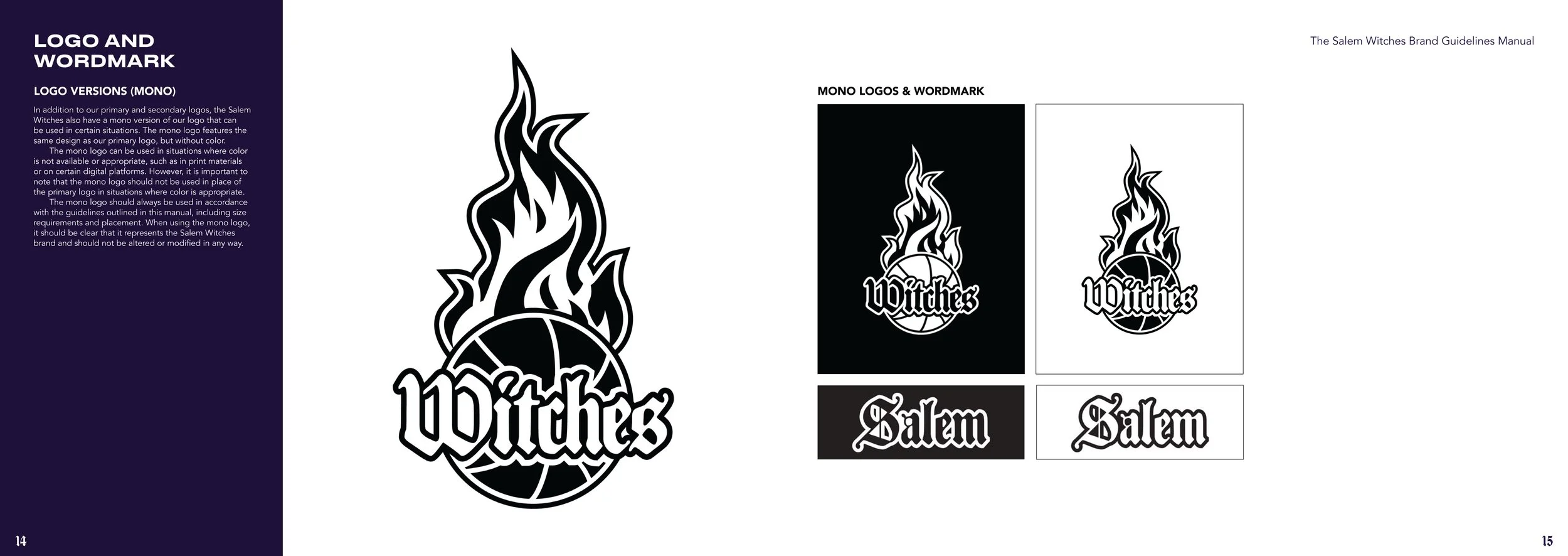
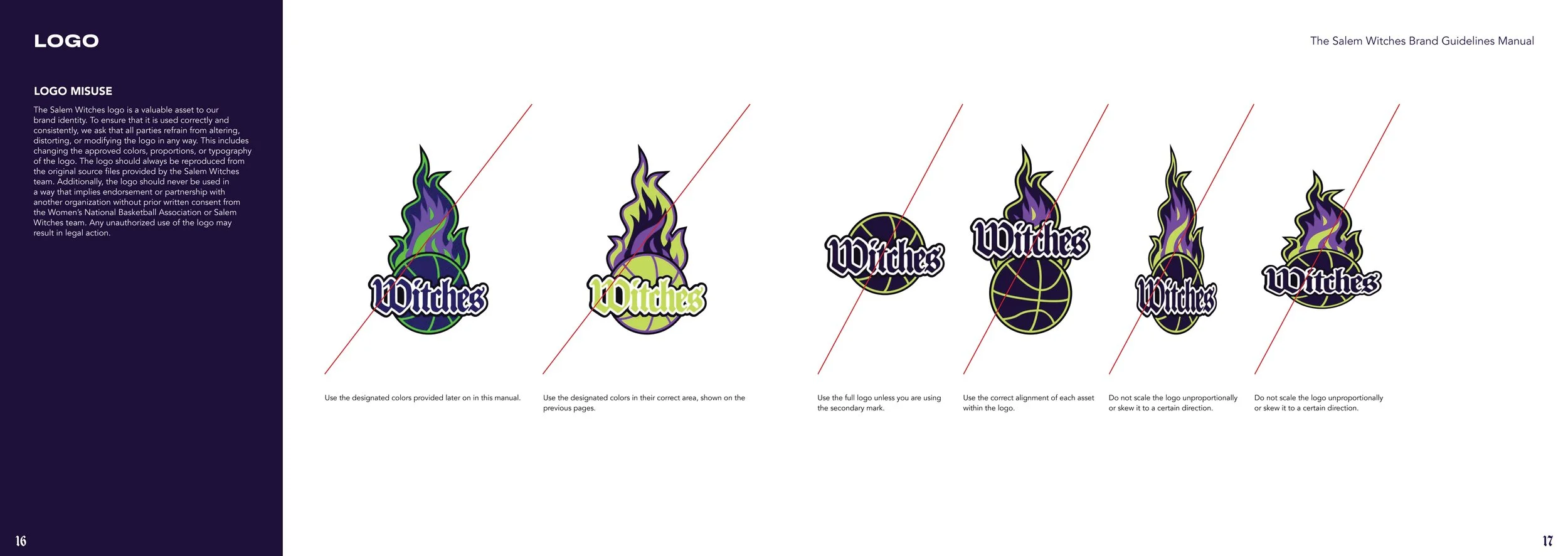
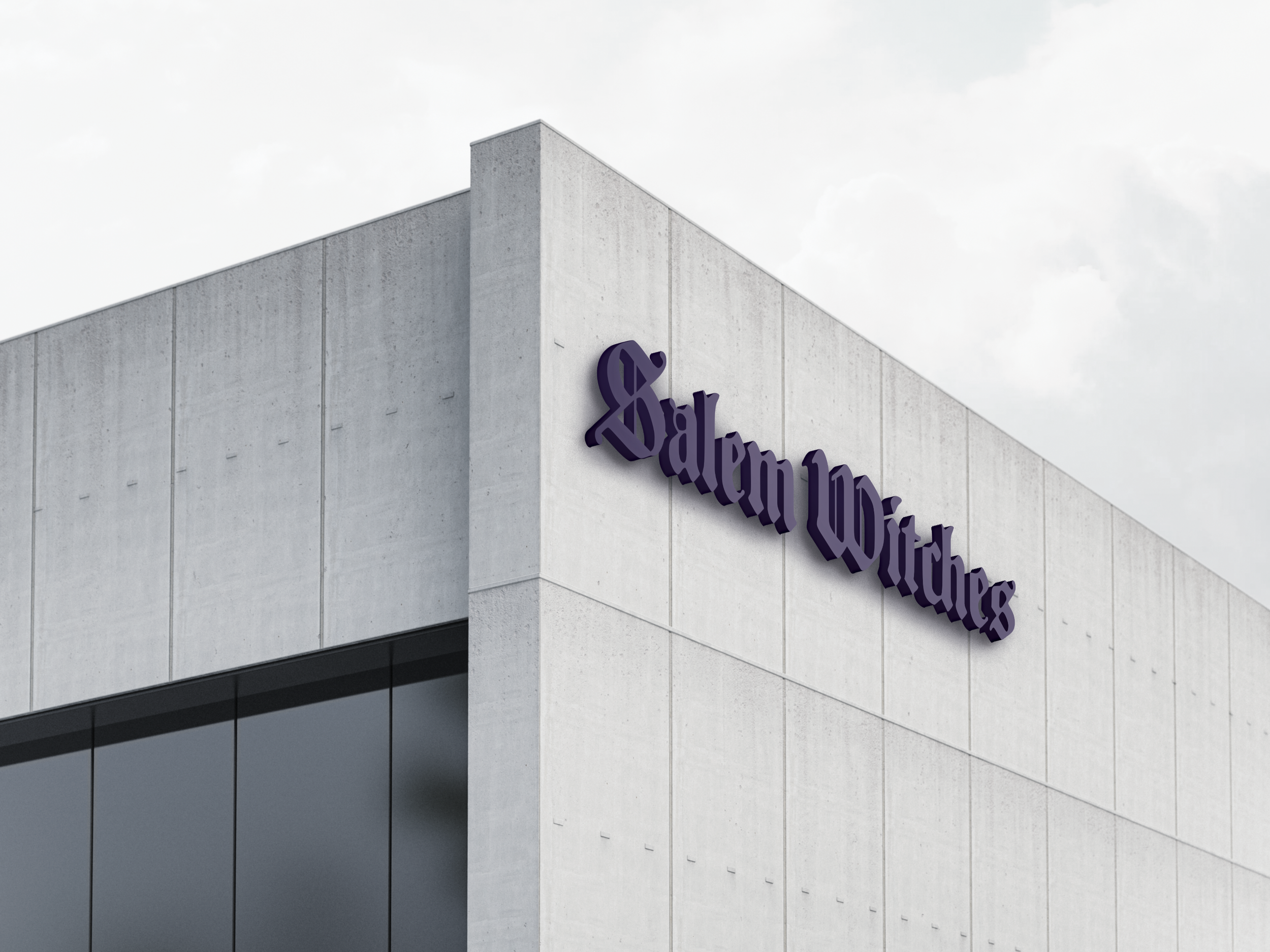
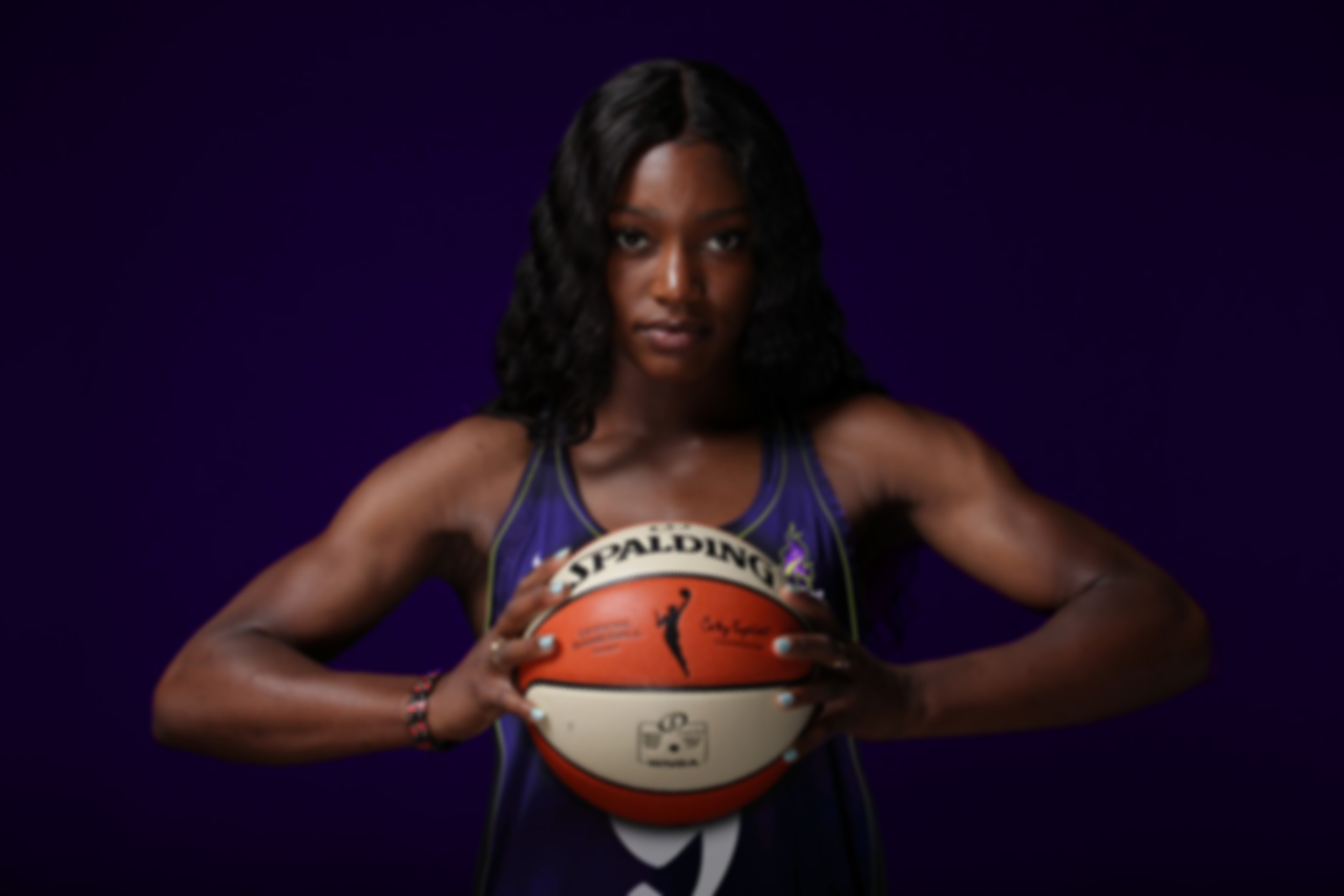
The Salem Witches logo is a dynamic, energetic design centered around a flaming basketball. Surrounding flames create a sense of motion and intensity, while the bold phantom lettering of ‘WITCHES’ is ominous, modern and highly legible — perfectly complementing the logo’s striking aesthetics and teams values.


Traditio AH was chosen for its historical connection to the Salem Witch Trial era, with its blackletter style reinforcing the ominous and archaic tone.

The basketball orb links the sport to a familiar symbol of witch culture — a fiery orb, evoking a mystical and powerful feeling.

A clean, modern interpretation of a historical era, drawing on its significance to connect the legacy of basketball with the past.