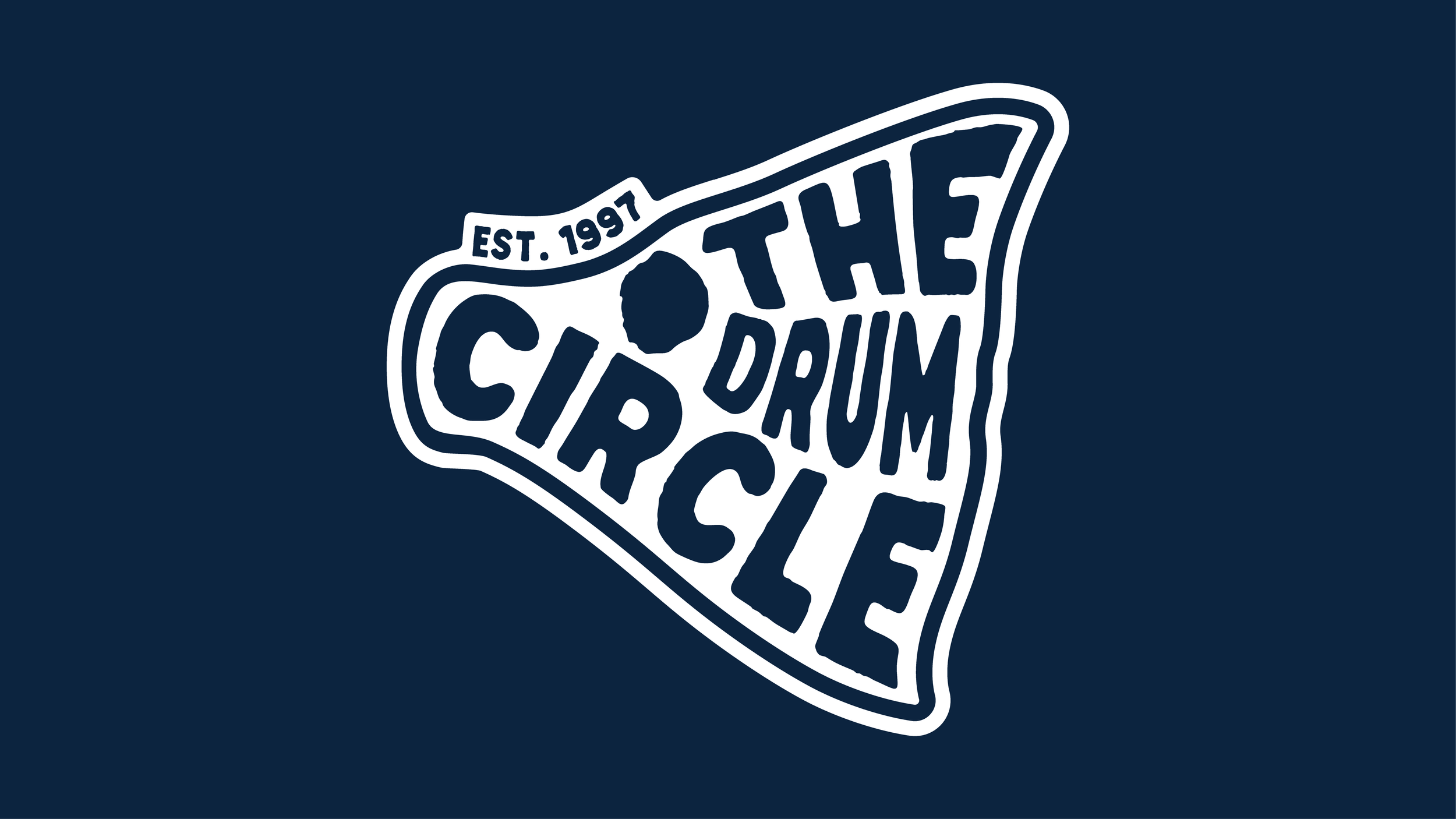
Logo & Merchandise Design
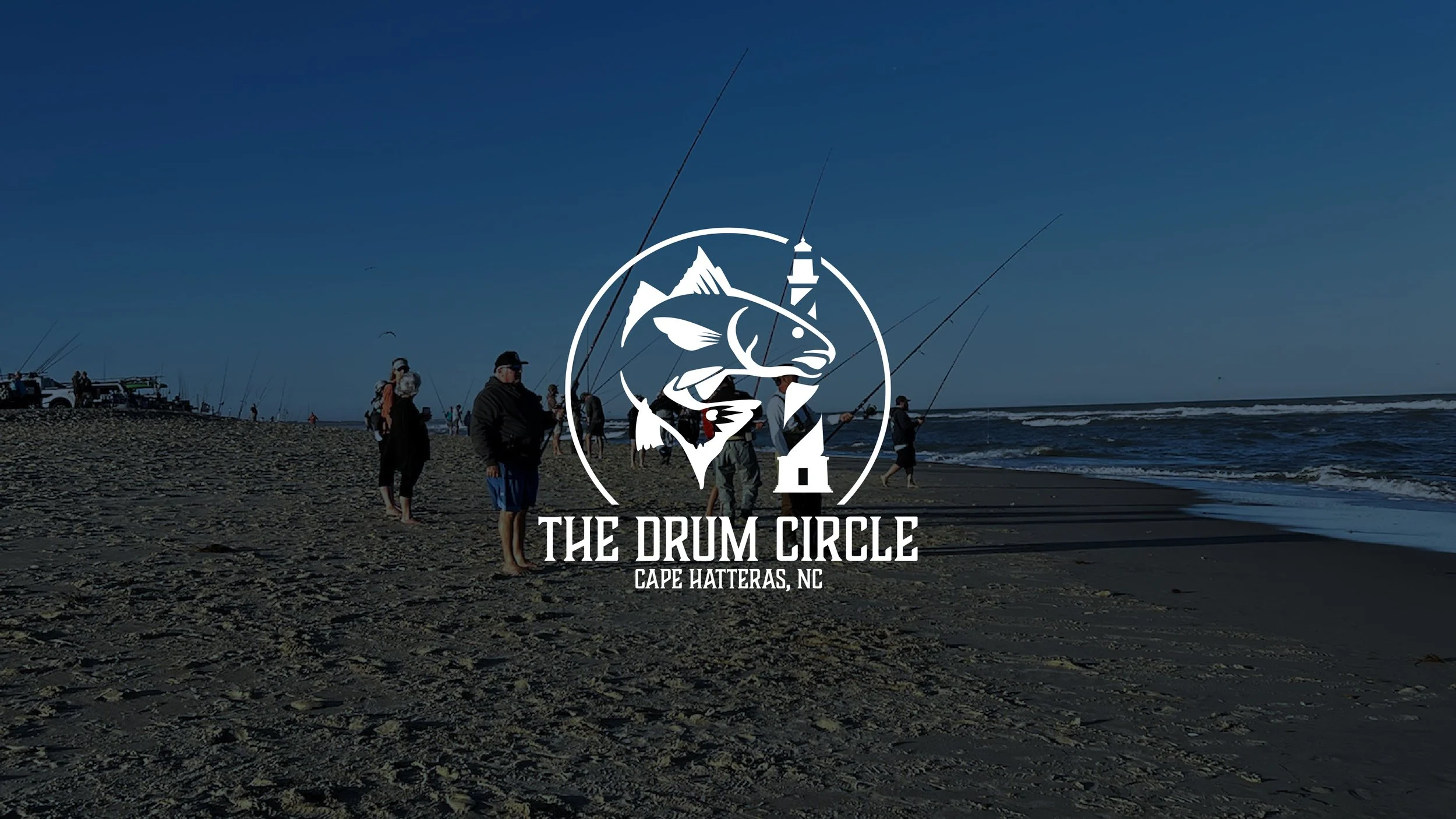
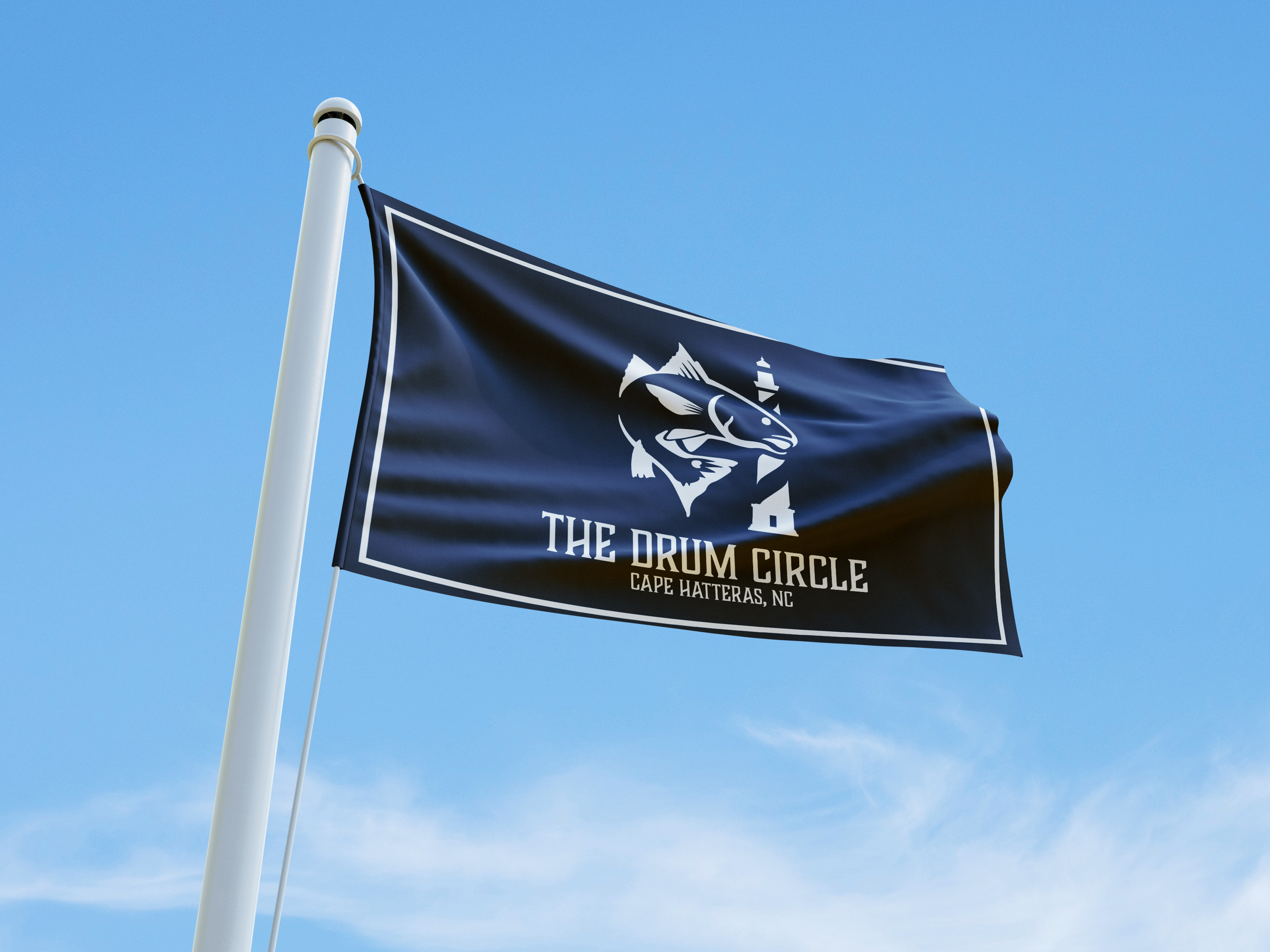
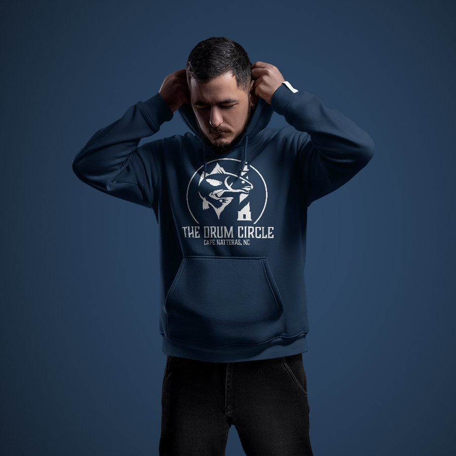
The Drum Circle logo began as a personal project, originally created for my dad and a close group of friends who fished together in the Outer Banks of North Carolina. What started as a casual emblem for a shared hobby quickly took on more meaning as their tradition grew. The logo gave the group a sense of identity—something to represent their camaraderie and love for drum fishing in the waters off Avon, Buxton, and Frisco.
Over time, the Drum Circle evolved into a more exclusive, “members-only” group with one simple rule: you must catch a red drum to earn your place. The logo became a symbol of that rite of passage, representing both the challenge and the pride of joining this tight-knit coastal crew. Designed with that spirit in mind, the mark reflects not just the sport of fishing, but the deep connection between people, place, and tradition.
Client
The Drum Circle
Year
2024-25


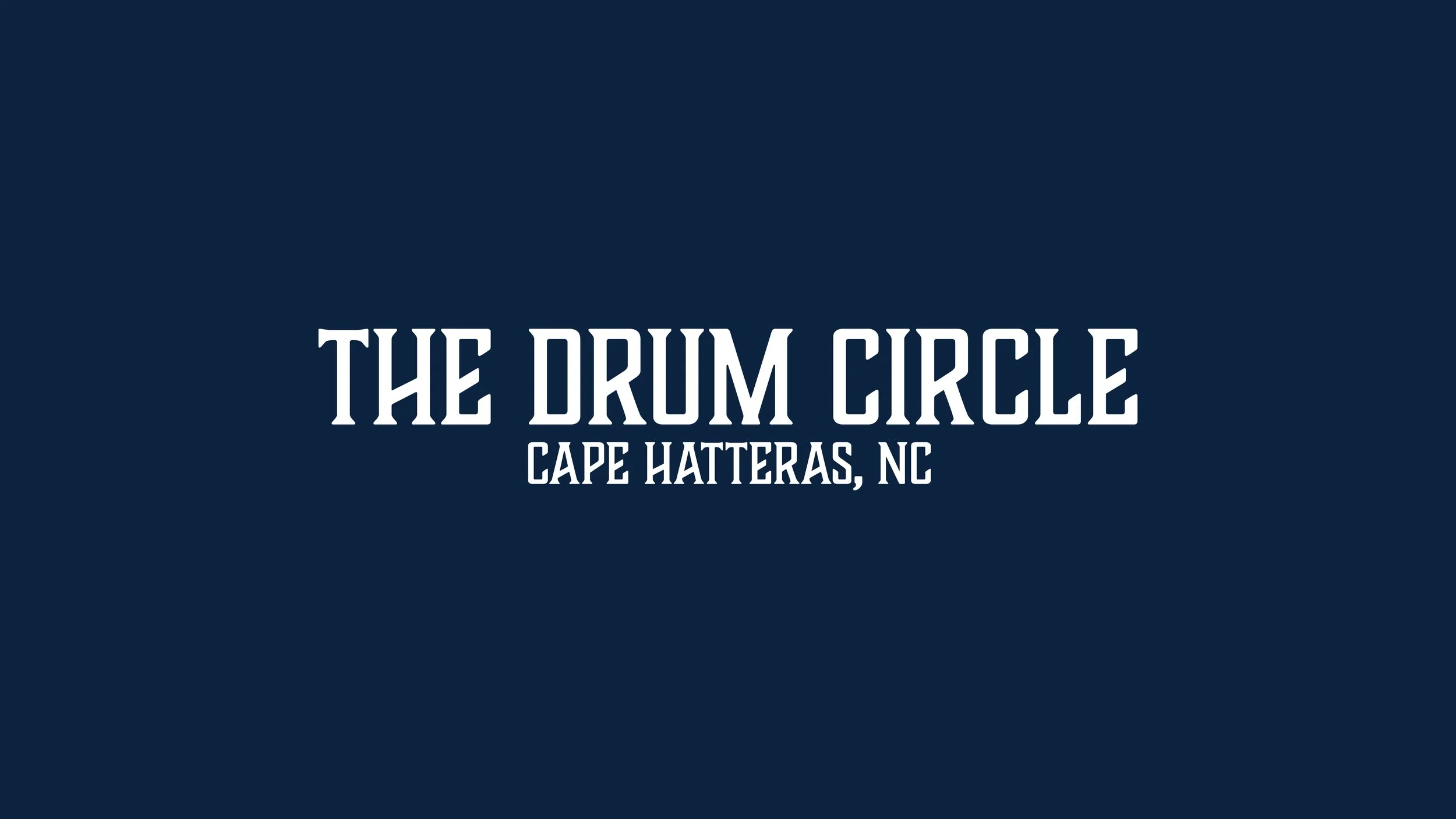
Boucherie Block was chosen for its bold, vintage feel, reflecting the pride, tradition, and rugged spirit of the Outer Banks fishing community.
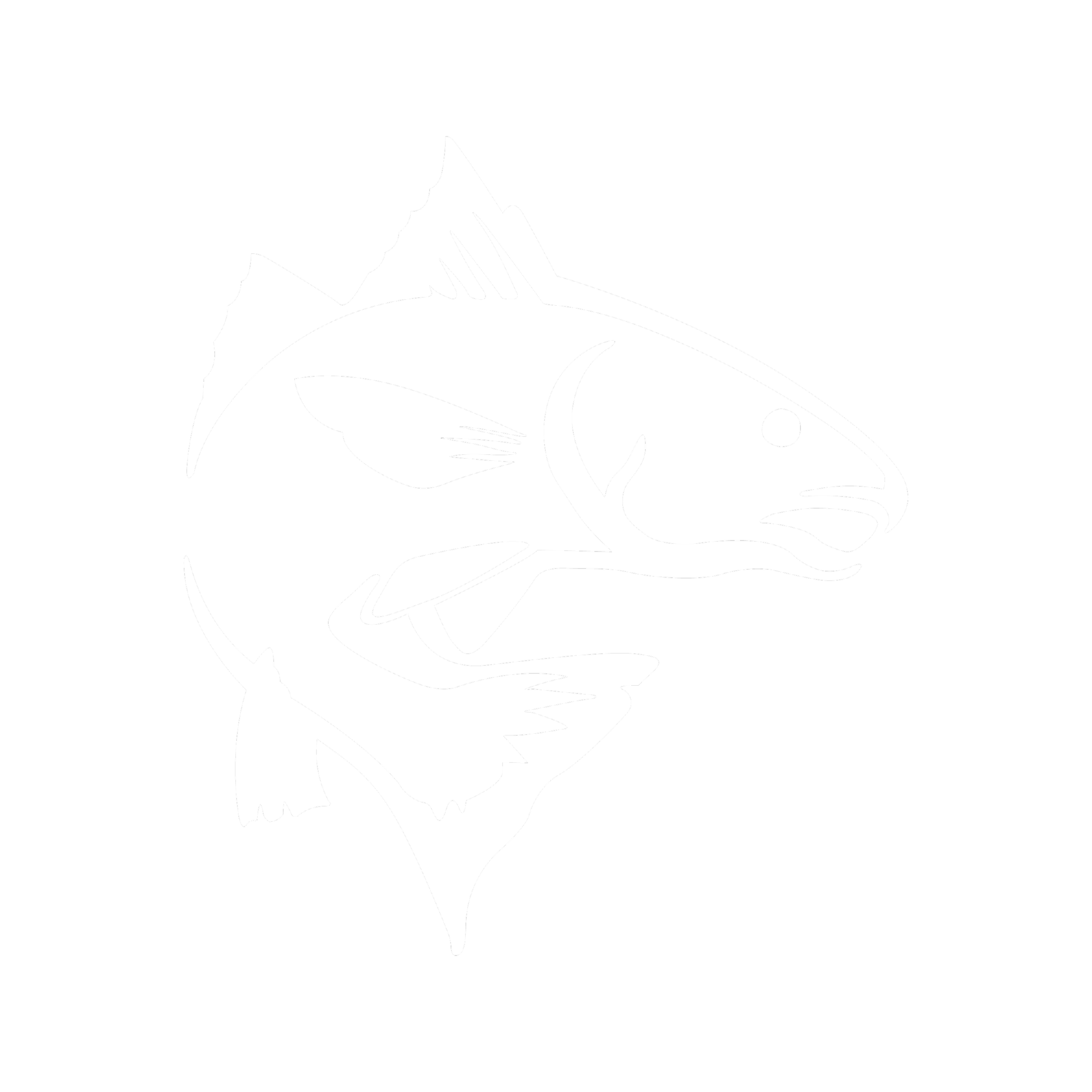
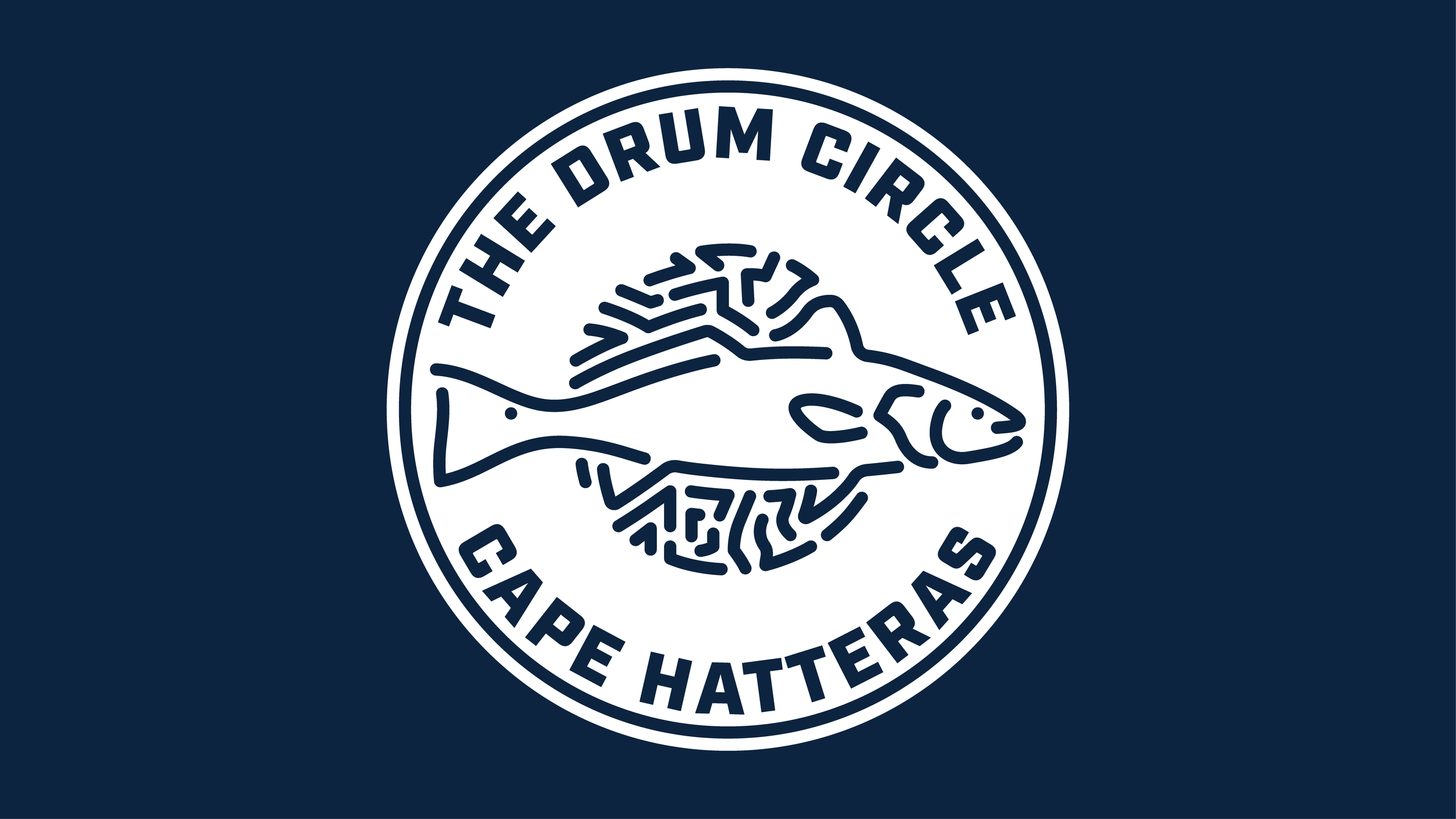
The red drum and Hatteras Lighthouse were chosen as iconic symbols of the Outer Banks. Together, they represent the region’s fishing culture and coastal identity, core to the group’s roots and sense of place.